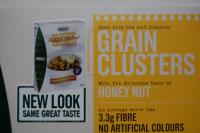
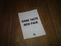
I hate the hackneyed advertising technique of slapping "New look, same great taste" on slightly rebranded piece of tat. It's just lazy. It dates back to a roller burger joint in the US in the 50s and has been trotted out for pretty much everything since. I don't know how ad execs get away with it, and still call themselves "creatives"!
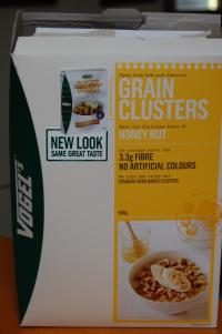
Here's another "New Look, Same great taste". I particularly love the way they put a picture of the box, on the box. Just in case you couldn't see the box, except obviously you are looking at the box...
But if you look closely at the picture of the box it doesn't look like the new box that you actually have. So what box did you get sold you chump. It's obviously very important that you get the right box.
Rants and raves